What I Plan To Do
For my assignment I plan to produce multiple images of a freaky or unique theme. I researched a total o 10 images which I liked and saw as suiting to the Freak or Unique theme. The majority o these images were edited into a black and white/grayscale colour scheme to give them a eerie edge.
From the images we chose we had to attempt to recreate some of them in some sort of way so that our images could also follow the Freak or Unique theme.
I, as an individual, plan to shoot my photography with a seamless white background, I can then focus on editing the the prop in my image rather than both the background and prop.
Friday, 16 October 2015
Photography Week 2-Memory Check
Q1. What two Greek words make up the term ‘photograph’?
1.Phōtos
2.Graphé
Q2. List FOUR genres of photography and explain the genre –
For example: Portraiture - Portrait photography or portraiture is photography of a person or group of people that displays the
expression, personality, and mood of the subject. Like other types of portraiture, the focus of the
photograph is usually the person's face, although the entire body and the
background or context may be included. (https://en.wikipedia.org/wiki/Portrait_photography)
1.Wildlife-Taking pictures of animals and plants, they can be doing any activity (if it's an animal, of course).
2.Sports-Photography based around shooting images of day to day sport, such as football.
3.Fashion-This kind of photography usually involves a model and a specific item of clothing, the images are usually taken with a seamless white background.
4.Landscape-This kind of photography involves the photographer taking pictures of places like forests and mountains. Some photographers may wait till certain types of day to take their shots as they may want to add in a sunset.
Q3. List two essential items you need to complete your photography
course
1.An SD card
2.A camera
Q4. What do we do to make the camera achieve focus?
Ans. Hold down the shutter button half way, this will make the camera focus on whatever is in frame.
Q5. The ‘mode dial’ on our camera has the following four acronyms,
what do they stand for and what do they control?
‘A’ = Aperture
‘P’ = Program
‘S’ = Shutter Speed
‘M’ = Manual
Thursday, 15 October 2015
Video Evaluation
 Production
For our filming piece, we produced a short advert that was made to promote an energy drink called Possessed. The advert had to be 15 to 30 seconds. As seen to the left we have produced the piece using Adobe Premiere.
Research
Foe our research we looked up numerous adverts and analyzed them, we looked at the diegetic and non-diegetic and the different types of shots they used when filming the advert. We did not have to base our advert of what we researched, those adverts were to just give us an idea of what to produce and how to produce it. Together as a class we also looked at two adverts, these adverts were advertising Lynx Excite and Tango Orange.
Skills and Learning
During filming, I learned how to use a video recording camera correctly, I learned of most of the shots before we started filming as we went off in groups filming various shots each so that we understood the different types.
Photoshop freaky images


The image of the clay woman that I edited was made to represent two shadows, as such. I edited the image to make it the prop as dark as possible while still maintaining features which identified it as the original prop, one of these features is the light reflecting of the prop. I darkened the entirety of the image so that the image would look freakier.
 The image of the shoe was made to look more unique than freaky. I edited the shoe to make it completely black, intentionally leaving the lighter areas visible. The sole of the shoe has a dark aura effect gliding across due to some of the editing processes I did, I left this effect as I thought it suited the theme nicely.
Tuesday, 13 October 2015
Photography Evaluation
Introduction
Our assignment for Media was titled Freak or Unique. This assignment was based around photography that has a freaky, eerie or ominous feeling to it. We had to produce 4 or so pictures that represented the Freak or Unique theme. Our images were to be taken on a seamless white background or in/at our own location of our choice.
Research
For my research images I found 10 freaky image that I thought stood out to me. The first three images I found were pictures of animals that had been merged/combined and formed a completely different specimen. The next 7 image followed the more horror-sided freaky theme, all of the other 7 images were edited into black and white and then edited in their own individual or similar ways. I liked two images that were edited similarly, one of these images was of a farm-like area, the image had been edited to make it look as if there was human silhouettes in the sky and the other images was of the silhouettes of hammerhead sharks that almost looked as if they were swarming. To find these images I searched various themes such as: eerie, spooky, scary, dark and horror.
Characteristics of Freaky/Unusual Photograph
Photographs can be seen as freaky or unusual because of how they are taken. These types of images are usually non-natural occurring and are most likely edited by the photographer to give it a freaky edge. One such example of editing would be to change the colour of an individuals eye(s) to another colour (most likely red) while making the rest of the picture black and white, this gives the individual a distinct look as the coloured eyes stand out in the entire picture and due to them being red, it makes them look evil as such. The majority of freaky pictures are usually in black and white or grayscale.
Ideas
For my ideas I intended to recreate Freaky/Unique images to recreate or base my images off of my research that I performed before going through with the Photo shoot. The ideas that I founded came to me through the research that I did on 10 images. The images that I researched each held their own unique theme and they inspired me to take similar images.
The Photography
Our photography took place within the college, we set up a seamless white background to shoot multiple images of different props that we had brought in or had been provided with. We did not have to record what time we took our pictures. I only used one model for my photography and I used a total of three props. We all used the same equipment for our photography, we all had to use a tripod, red-head lights and a camera.
Final Images
 These final images I produced were shot with a seamless background and edited/finalized in Photoshop. For my first image I took into changing the image to black and white and then began to change the brightness and levels of the picture.
For the second picture I took pictures of a models arms and hands on a dark surface. I then removed the users arms from the picture and left the hands. I edited the hands individually, but with the exact same adjustments. My purpose for this image was to create a picture which had noise implemented into it, the original image had very minimal noise so I edited it in using Photoshop. I edited the background in a similar way to the hands and gave it a distinct amount of noise. The hands in the picture are supposed to look as if they are trying to drag they're body into the picture.

 My third image was edited similarly to my first image. My first adjustment was to change the image to black and white, I then proceeded to change the light and the contrast of the picture. I altered the brightness and contrast multiple times till the sole of the shoe began to look as if it was stained with a black substance, I then went onto changed the gamma of the picture and I also changed the images exposure. I left the image as final after I had altered it to look as if it had been completely blacked out, leaving only the whites of the shoe visible, yet stained.
Next Time and What I Learned
On my next assignment I would look more into editing skills and tools so that I can produce better final images for my assignment. Although I believe I edited my shots well, I think that they could be far better than they actually are, but being relatively new to photography and amateur at Photoshop, I was not able to produce images to the standard I wish I could have.
From this first assignment I have learned how to set up a simple seamless background for photo shoots, how to operate a camera properly and how to use more tools on Photoshop for editing. I have learnt more than I expected to during this course and have definitely learned there is more to Photography that just pointing your camera at something and pressing a button, for example, the 'Rule of Thirds' was something that I had never heard of before this assignment and it helped me a lot during my photo shoot. I hope that for my next assignment I will be able to learn even more about Photography as I have become more interested in it than I thought I would.
Our assignment for Media was titled Freak or Unique. This assignment was based around photography that has a freaky, eerie or ominous feeling to it. We had to produce 4 or so pictures that represented the Freak or Unique theme. Our images were to be taken on a seamless white background or in/at our own location of our choice.
Research
For my research images I found 10 freaky image that I thought stood out to me. The first three images I found were pictures of animals that had been merged/combined and formed a completely different specimen. The next 7 image followed the more horror-sided freaky theme, all of the other 7 images were edited into black and white and then edited in their own individual or similar ways. I liked two images that were edited similarly, one of these images was of a farm-like area, the image had been edited to make it look as if there was human silhouettes in the sky and the other images was of the silhouettes of hammerhead sharks that almost looked as if they were swarming. To find these images I searched various themes such as: eerie, spooky, scary, dark and horror.
Characteristics of Freaky/Unusual Photograph
Photographs can be seen as freaky or unusual because of how they are taken. These types of images are usually non-natural occurring and are most likely edited by the photographer to give it a freaky edge. One such example of editing would be to change the colour of an individuals eye(s) to another colour (most likely red) while making the rest of the picture black and white, this gives the individual a distinct look as the coloured eyes stand out in the entire picture and due to them being red, it makes them look evil as such. The majority of freaky pictures are usually in black and white or grayscale.
Ideas
For my ideas I intended to recreate Freaky/Unique images to recreate or base my images off of my research that I performed before going through with the Photo shoot. The ideas that I founded came to me through the research that I did on 10 images. The images that I researched each held their own unique theme and they inspired me to take similar images.
The Photography
Our photography took place within the college, we set up a seamless white background to shoot multiple images of different props that we had brought in or had been provided with. We did not have to record what time we took our pictures. I only used one model for my photography and I used a total of three props. We all used the same equipment for our photography, we all had to use a tripod, red-head lights and a camera.
Final Images
These final images I produced were shot with a seamless background and edited/finalized in Photoshop. For my first image I took into changing the image to black and white and then began to change the brightness and levels of the picture.For the second picture I took pictures of a models arms and hands on a dark surface. I then removed the users arms from the picture and left the hands. I edited the hands individually, but with the exact same adjustments. My purpose for this image was to create a picture which had noise implemented into it, the original image had very minimal noise so I edited it in using Photoshop. I edited the background in a similar way to the hands and gave it a distinct amount of noise. The hands in the picture are supposed to look as if they are trying to drag they're body into the picture.

 My third image was edited similarly to my first image. My first adjustment was to change the image to black and white, I then proceeded to change the light and the contrast of the picture. I altered the brightness and contrast multiple times till the sole of the shoe began to look as if it was stained with a black substance, I then went onto changed the gamma of the picture and I also changed the images exposure. I left the image as final after I had altered it to look as if it had been completely blacked out, leaving only the whites of the shoe visible, yet stained.
Next Time and What I Learned
On my next assignment I would look more into editing skills and tools so that I can produce better final images for my assignment. Although I believe I edited my shots well, I think that they could be far better than they actually are, but being relatively new to photography and amateur at Photoshop, I was not able to produce images to the standard I wish I could have.
From this first assignment I have learned how to set up a simple seamless background for photo shoots, how to operate a camera properly and how to use more tools on Photoshop for editing. I have learnt more than I expected to during this course and have definitely learned there is more to Photography that just pointing your camera at something and pressing a button, for example, the 'Rule of Thirds' was something that I had never heard of before this assignment and it helped me a lot during my photo shoot. I hope that for my next assignment I will be able to learn even more about Photography as I have become more interested in it than I thought I would.


Monday, 12 October 2015
Lesson Start-12/10/15-Memory Check
Q1) ISO stands for International Standards Organisation, it effects how sensitive something is to light.
Q2) P is Programmed Automatic mode, in this mode your camera adjusts some of its settings itself while leaving some left for you to adjust.
Q3) Fasten in the camera properly so that it doesn't fall off the tripod/make sure the base-plate is secure
Make sure the legs of the tripod are locked in place so that the it doesn't collapse
Q4) When removing the light from the setup or putting it away, ensure that it has cooled down
Ensure the lights stand/tripod legs are locked in place to prevent it from collapsing
Don't touch the light when it is active (barn doors)
Q5) A rectangle will appear in the viewfinder, this is the center of focus
Q6) Curves and levels can be used
Adjust the exposure
Sunday, 11 October 2015
10 Freaky pics (page 2)


This image would be difficult to replicate due to the animal within the image being a hammerhead shark. If I were to replicate this image I would use some other animal or create an image with a similar look and feel. I like this image for a similar reason to the first image, the image gives off a sense of invasion. Also, because they are sharks, they deliver a more menacing feel.


Thursday, 8 October 2015
Advert Template, Final and Evaluation

In today's lesson we had to produce a paper copy of our magazine advert and a final Photoshop version, similar to the paper copy we produced. I believe my paper copy is very basic copy as compared to my final advert, that I produced on Photoshop.
 I produced an advert for an energy drink on Photoshop for my final Graphics piece. To produce my Photoshop image I briefly thought of how most magazine adverts are presented today, I researched the dimensions/measurements of a magazine page so that I could produce my advert correctly. I also researched what a lot of magazine adverts contain, this allowed me to produce my advert more effectively in the long run. To produce my adverts I used Photoshop skills I already knew, I also learned how to use the Magic Wand before making my advert. This tool allowed me to remove the background from my text. When producing my advert I also used another Adobe program to produce the star shape in the middle of my advert, this program was Illustrator.
I feel that my final piece went well, although it did not resemble any of my drawn pieces I was still proud of what I produced as final. The are only a few things about my final piece that I do not like such as the £1 sign.
If I were to produce this advert again I would take more time into researching Photoshop tools and I would practice using them. This is so I could edit the advert a lot better and produce a more detailed and better final piece.
3 Adverts
VW 'The Force' Advert
- · The Force-Volkswagen
- · This advert uses very little diegetic sound
- · The advert is mostly non-diegetic
- The song used in the advert is primarily made up of minor keys
- The song is has a slow tempo, it gets slower at the climax of the advert
- The song used has a broad key range

Make-up Advert
- Maybelline Fit Me Make-Up System TV Advert
- The key of the song is very small
- The song is primarily made of major keys
- There is only one diegetic sound in the advert, that being the narrator
- The only non-diegetic sound is the background music used in the advert.

·
- The tempo of the song in the advert is fast to emphasize the adrenaline
- The key of the song is average
- The song is primarily made up of major keys
- There are two diegetic sounds, dialogue and the narrator at the end
- The background music in the advert is non-diegetic

Original Images Used For Ghostly Images


The 3 background images that I used were the house, the man in the lake and the forest. The house looks like a typical horror house in a ghost story so I thought it would suit a ghostly man well, the forest background went well with the owl because they are both heavily associated with nature and the picture of the man in the lake made it look as if he is looking at the dragon in the distance, the way he has his body positioned almost makes it look like he is in a state of fear because of the dragons immense size in the final piece as it overviews the area he is in quite easily.


Sunday, 4 October 2015
10 Freaky pics (Page 1)


 This particular image caught my eye because of the strange combination between two unlikely animals. The image has been edited with Photoshop to combine the bodies of the animals. This image would be difficult to replicate with my own photography as Zebra's are only seen in zoo's in the UK.
The second picture I that I liked is of similar conjunction to the first image. The image consists of two animals which have been fused together in a weird way to, in a sense, 'freak' people out. This image was edited using the clone stamp tool to paint the mouth of the shark onto the face of the dog. This image would be easier to replicate than the first although still prove difficult as I would have to be able to get a close up picture of a Great White Shark.
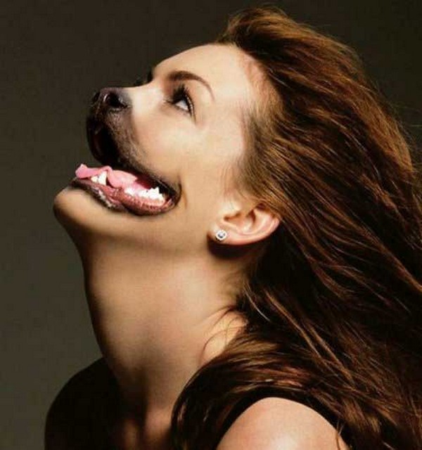
The third image that I found is the moderately easy to replicate. The image clearly consists of a person and a dog, the person is used for the majority of the photo, whereas the dog is only used as a mouth and nose. The image was probably edited using Photoshop.
Thursday, 1 October 2015
Four Fonts

Subscribe to:
Comments (Atom)